
SOMA
Elevating the online shopping
experience for SOMA.
01 — Overview
At Soma Intimates, I designed homepage and product listing page (PLP) experiences for a high-velocity seasonal campaign cycle, balancing promotional messaging with product discoverability across 30+ homepage launches and 40+ PLPs.
Campaigns shipped weekly, which meant layouts had to hold up under constant iteration without losing visual clarity or usability. I built modular, reusable design patterns that let the team launch new promotions quickly while keeping the browsing experience consistent for shoppers.
Role: Digital Designer (UX-Focused Responsibilities)
Company: Soma Intimates, Chico's FAS
Scope: 30+ Homepages · 40+ PLPs · Mobile Optimization
02 — Design Challenge
Seasonal promotions needed to launch fast — often weekly — without disrupting how shoppers found and evaluated products. Promotional messaging (sales, new arrivals, seasonal pushes) had to sit clearly on the homepage and PLP grid without crowding product visibility or breaking scan patterns shoppers relied on.
The core tension: how do you keep promotional real estate flexible and eye-catching, while keeping product discovery fast and predictable?
That tension shaped every layout decision that followed — hierarchy, spacing, module structure, and the design system that held it all together.
03 — Homepage design
Across 30+ homepage launches, I structured promotional layouts around a consistent hierarchy: hero messaging first, clear navigation second, a single strong call-to-action, then product modules that transition shoppers from campaign context into browsing.
The hero always carries the heaviest visual weight — it's where campaign identity lives, and it changes most often between launches. Navigation, by contrast, stays visually neutral and fixed in position, so shoppers can always find their way regardless of what's being promoted above it. Every homepage gets exactly one primary CTA — never two competing buttons pulling attention in different directions.
Below the fold, promotional modules step down in visual weight, easing shoppers toward product discovery rather than holding them in campaign messaging indefinitely.


Two different campaigns, same underlying structure: hero promo, category shortcuts, a mid-page lifestyle banner, then product spotlights leading into a closing offer. The message, color palette, and offer change every launch — the hierarchy doesn't.
Design considerations:
Clear hero hierarchy that changes weekly without breaking the layout
Fixed, neutral navigation independent of campaign styling
One dominant CTA per page
Modular promotional blocks that step down in visual weight toward
product content
04 — PLP Structure
Across 40+ PLPs and category pages maintained monthly, the challenge was different from the homepage: promotional messaging needed to sit inside the browsing experience without disrupting it. Rather than placing a banner above the grid, I embedded promotional tiles directly into the product grid itself — treated as one cell among the products, not a separate element competing for attention above them.
This kept the grid structure completely consistent regardless of category: a title, a row of related sub-category tiles, then a 4-column product grid where one tile might carry a promotional message while the rest show products, without ever breaking the visual rhythm of the page.
The result is a layout where campaign storytelling and structured browsing genuinely coexist — the promotional tile reads as part of the collection being browsed, not an interruption to it.
Design considerations:
Promotional content embedded as a grid cell, not a header or banner
Consistent 4-column product grid across every category and campaign
Sub-category tiles for lateral navigation without leaving the page
Visual rhythm of the grid never broken, regardless of what's
being promoted


New Arrivals and Feel-Great Fabrics — different categories, different imagery, same structure underneath: title, sub-category tiles, then a 4-column product grid with one promotional tile woven directly into it.
Unlike the homepage's flexible, module-based layout, the PLP was built on a strict 4-column grid — equal gutters, equal margins, applied consistently whether a cell holds a product or a promotional tile. This is what let promotional content sit inside the browsing experience without ever breaking the underlying structure.
Design considerations:
Promotional content embedded as a grid cell, not a header or banner
Consistent 4-column product grid across every category and campaign
Sub-category tiles for lateral navigation without leaving the page
Visual rhythm of the grid never broken, regardless of what's
being promoted
05 — Design System
With weekly campaign launches, speed depended on having a set of reusable modules rather than designing each homepage from scratch. Hero banners, category tile rows, two-panel promo blocks, and lifestyle banners were built as consistent, swappable components — the same module structure could carry a completely different campaign message without needing new layout decisions each time.
This is most visible comparing two homepages built weeks apart: the module order, sizing, and spacing stay identical, while only the imagery and offer content change.


Hero module — same layout, different campaign imagery and message

Category tile row — reused identically across both launches

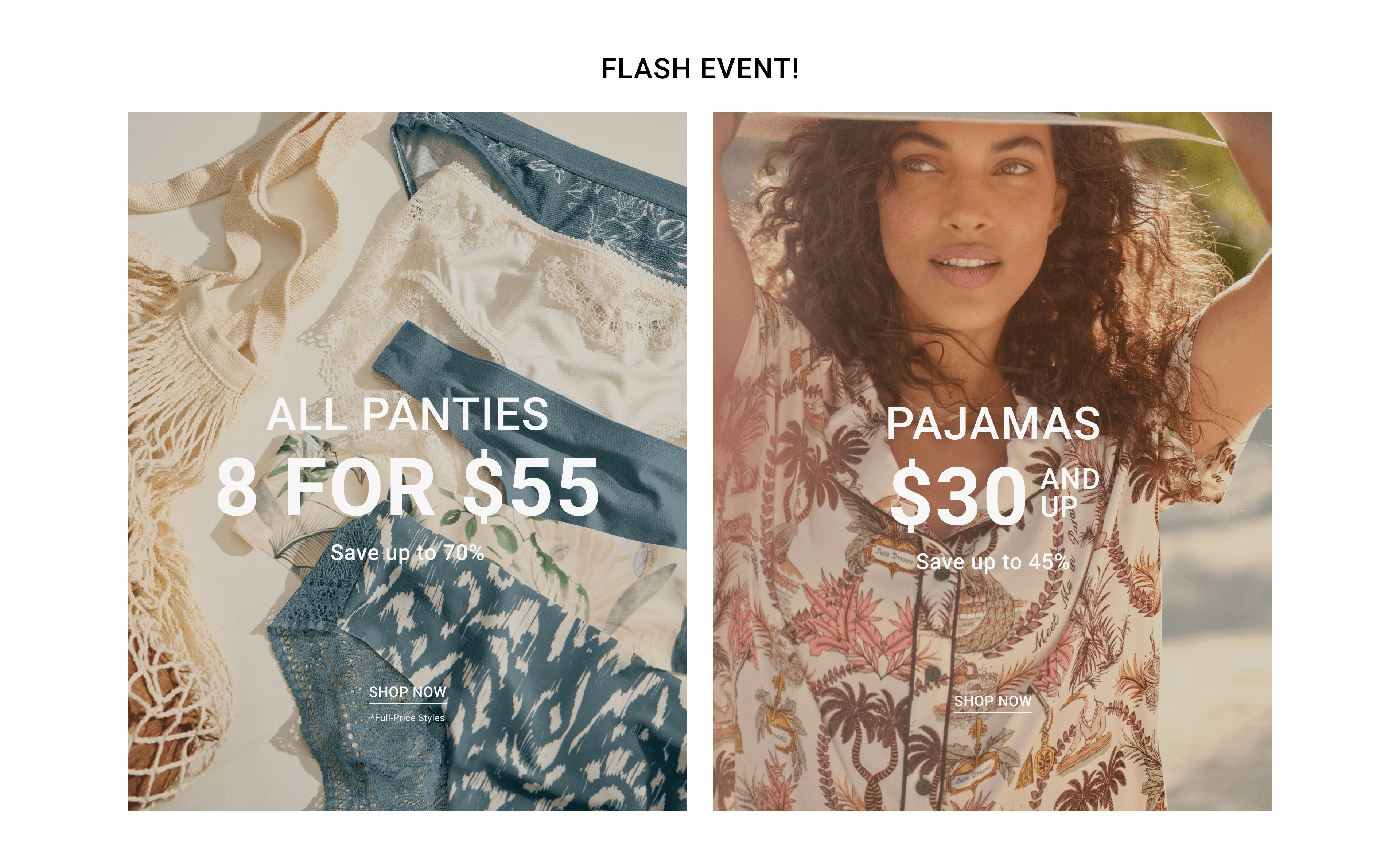
Promo block —same two-panel structure, different offer and product
Some modules, like the category tile row, were reused exactly across launches. Others, like the hero and promo block, kept the same structure while swapping in new imagery and messaging — proving the system flexed without breaking.
Design considerations:
Modular components reused across campaigns (hero, tile row, promo block, banner)
Swappable content within a fixed module structure — no per-launch layout decisions
Consistent spacing and sizing across modules, even without a strict grid system
Faster production without sacrificing visual consistency
06 — Mobile Optimization
Mobile wasn't a simple scale-down of the desktop layout — several modules were rebuilt or removed to fit a narrower, more vertical browsing pattern. The homepage hero kept its core image and headline across both breakpoints, but the supporting 3×3 photo grid that sat beside it on desktop was dropped entirely on mobile, since there wasn't room to preserve it without shrinking every image past the point of usefulness.
The 5-item category row followed a different pattern: rather than stacking or disappearing, it became a horizontally scrollable strip — letting shoppers swipe through the same five entry points without consuming excessive vertical space. Two-panel promo blocks further down the page reflowed more conventionally, stacking into single-column sections without losing any content.


Design considerations:
Content removed, not just resized, when it couldn't hold up at mobile width (3×3 grid)
Horizontal scroll used for category tiles instead of vertical stacking, to preserve quick browsing
Two-panel promo blocks stack cleanly into single column with no content loss
Hero headline and CTA preserved exactly across breakpoints — highest-priority content stays intact
07 — Reflections
What I learned
Working at this pace showed how much a strong hierarchy system does the heavy lifting. Once patterns were established — hero-first layouts on the homepage, grid-embedded promos on PLPs, reusable modules across campaigns — new launches could plug into them fast, without sacrificing usability for speed.
What I'd improve
Some modules, like the 3×3 photo grid on the homepage hero, didn't have a real mobile equivalent — they were simply dropped rather than redesigned for smaller screens. I'd want to revisit that gap with an actual mobile-first version of that content, rather than treating removal as the default solution.
What I'd test next
I'd want real behavioral data — scroll depth, click-through on the horizontally scrollable category tiles, engagement with grid-embedded PLP promos — to validate whether these structural decisions actually performed the way the design intended, rather than relying on visual/systems reasoning alone.
